Call now - 07342 566 985

Category: Photography blog

Studio Hire Versus Location Shooting Compared

A last-minute rain shower, an unavailable meeting room or a customer walking through frame can turn a carefully planned shoot into an expensive waiting game. The choice between studio hire versus location shooting is not simply about visual style. It affects your schedule, crew size, product handling, approvals and the number of usable images you take home.

For a fashion editorial, a brand film or an ecommerce campaign, both options can produce brilliant work. The stronger choice is the one that supports the brief rather than forcing the brief to fit the setting.

Studio hire versus location shooting: the real decision

A studio gives you a controlled environment built for making images. A location gives you context that cannot always be replicated. Neither is automatically better. The right decision comes down to what must remain consistent, what needs to feel believable, and where your budget is most likely to stretch.

If you are photographing fifty product variations for an online shop, consistency usually matters more than a dramatic setting. If you are capturing a chef in their own restaurant or filming a tradesperson at work, the real environment may carry the story far more effectively than a constructed set.

Start with the intended use of the content. Images for marketplaces, catalogues and paid advertising often need clean framing, accurate colour and repeatable lighting. Social campaigns, documentary-led films and brand stories may benefit from the texture, movement and personality of a genuine place.

What a studio gives your production

The most valuable thing a studio provides is control. You decide where the light falls, what appears in the background and when the shoot starts. There is no need to wait for cloud cover to pass or ask a venue manager whether a corner can be cleared for ten more minutes.

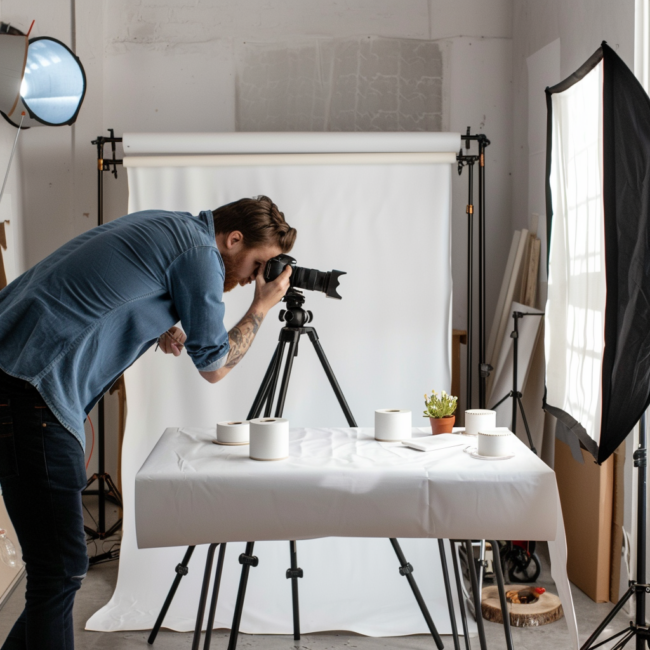
That control is particularly useful when deadlines are tight. A large, open-plan space lets teams run several setups across a day: product packshots in one area, lifestyle content in another, and video interviews away from the main activity. With an infinity cove, backdrops, props and dedicated lighting available, you can move from idea to execution without transporting a van full of kit between venues.

Studios are also designed around practical production needs. Power is where you expect it to be. Equipment can be brought in safely. Products have somewhere clean to be unpacked, assembled and stored. Hair, make-up, styling and client review can happen without competing with the public or a business operating around you.

For ecommerce teams, this matters more than it may first appear. Consistent camera angles and lighting help shoppers compare products confidently. It also reduces the time spent correcting mismatched backgrounds, colour casts or stray reflections in post-production. A controlled shoot may cost more per hour than an informal on-site session, but it can create a more efficient production overall.

At Silkwood Studio, the scale of the space means photographers, brands and production teams can build multiple looks without treating every set change as a full reset. That is useful when the shot list is ambitious and the delivery date is not moving.

Better control does not mean lifeless imagery

A common concern is that studio work will look too polished or detached from real life. That can happen if every image relies on the same plain backdrop and flat light. It does not need to.

Set dressing, textured surfaces, coloured paper, furniture, natural-light setups and carefully chosen props can give a studio shoot warmth and character. The difference is that you are designing the atmosphere rather than accepting whatever happens to be in the room. For product launches and content days, that flexibility can make one booking work much harder.

When location shooting earns its place

Location shooting is often the best route when place is part of the message. A boutique hotel, workshop, family home, office, sports venue or rugged Yorkshire landscape can immediately tell an audience who the brand is for and how its product belongs in the real world.

Real locations offer details that are difficult to manufacture convincingly: worn worktops, changing street light, staff who know their craft and an environment with genuine history. For hospitality, interiors, construction, food, tourism and service-led businesses, those details build trust. They show customers the experience rather than asking them to imagine it.

Location work can also make people feel more relaxed. A founder speaking in their own workplace may come across as more natural than they would under studio lights. Models can interact with authentic surroundings, giving lifestyle content the small imperfections and believable gestures that audiences respond to.

But atmosphere comes with variables. Access may be restricted to a short window. You may need permission to film, releases from people in the background, parking arrangements, extra insurance or a plan for noise. Daylight changes quickly, particularly through a British winter, and many locations have limited power, low ceilings or no suitable space for a changing area.

None of these issues makes a location unsuitable. They simply need to be costed and planned properly before the day.

Compare the costs beyond the hire fee

A studio hire price is usually clear from the outset. You can budget for the space, equipment, technical support and your team. Location costs can look lower on paper, especially when shooting at a client site, but the hidden hours can add up.

Consider travel time, loading, parking, permits, location fees, weather cover, security, extra lighting, power solutions and the possibility of returning because a key shot was missed. A two-hour shoot in Manchester can become an all-day commitment once travel and setup are included. Equally, hiring a premium venue may be worthwhile if its interiors provide several campaign-ready sets in one place.

The question is not, ‘Which option is cheapest?’ Ask instead, ‘Which option gives us the most usable content for the available budget?’ A well-planned studio day can deliver a large library of assets efficiently. A carefully selected location can give a brand campaign the credibility that makes the extra logistics worthwhile.

Match the setting to the shot list

Your shot list should lead the decision. If it calls for precise cut-outs, consistent product angles, stop-motion clips or content that will be added to an existing catalogue over several months, use a studio. You need repeatability.

If it calls for wide environmental portraits, a service in action, real customer interaction or a distinctive building that audiences already recognise, explore location shooting. You need context.

Some of the strongest campaigns use both. Photograph core products in the studio for clean website and marketplace listings, then take selected hero products on location for social, advertising and editorial content. This approach protects the practical assets while giving the campaign a more expressive side.

It can also be useful to recreate the controlled parts of a location shoot in the studio. For example, film a founder interview on site, then capture close product details, voiceovers and alternative campaign stills in a quieter, more manageable environment. Your final edit benefits from having options.

Plan for people, not just pictures

The setting affects how everyone works. A small shoot with one photographer and a founder may travel easily. A larger production with models, stylist, make-up artist, videographer, sound recordist, client team and products needs room to move.

Before committing, check whether the setting can support the people involved. Can the crew unload without blocking access? Is there a private place for wardrobe changes? Will someone be responsible for keeping the area clear? Is there enough time for a client to review images before the setup disappears?

Studios tend to simplify these operational details, which is why they are a reliable choice for multi-person commercial shoots. Locations can still work brilliantly, but they need a more exact production plan. Build in time for arrival, safety checks, setup, resets and pack-down. Rushing those stages is where both quality and morale tend to suffer.

Four questions to ask before booking

If the answer to most of these is ‘yes’, a studio is likely the practical choice:

  • Do you need identical lighting, backgrounds or angles across many products or scenes?
  • Will the shoot involve several crew members, frequent set changes or substantial equipment?
  • Is weather, public access or venue noise a risk to your deadline?
  • Do you need space for styling, product preparation, client review or multiple setups?

If the story depends on a real setting, location shooting may still be the right call. The aim is not to eliminate unpredictability altogether. It is to choose the unpredictability that adds something to the work.

Make the day work harder

Whichever route you take, plan more than the hero shot. Think about portrait crops, landscape crops, short-form video, behind-the-scenes material, detail shots and seasonal edits while the set, talent and products are already available. Small additions to the schedule can save a separate production day later.

Bring a clear shot list, but leave room for the unexpected image that gives the campaign its edge. In a studio, that may be a new lighting angle or prop combination. On location, it may be a moment of real interaction that could never have been scripted.

Choose the setting that lets your team concentrate on creating rather than compensating. When the space supports the brief, the work feels easier – and the final images have more room to do their job.

Product Photos or CGI Renders: Which Works?

A new product is ready to sell, the listing needs to go live, and one decision shapes almost every first impression: product photos or CGI renders? Both can make an item look desirable. Both can work across Amazon, eBay, retail websites and campaign content. But they solve different problems, and choosing on price alone can leave a brand with imagery that looks polished yet fails to answer a buyer’s real questions.

For most ecommerce businesses, the right route comes down to the product itself, the number of variations, how quickly the range will change, and what customers need to see before they commit. The strongest image strategy is often less about picking a side and more about knowing where each method earns its place.

Product Photos or CGI Renders: The Core Difference

Product photography captures the real object. Its material, scale, texture, finish and minor imperfections are all present in the frame. A good commercial shoot controls light, styling, angle and retouching, but the product remains recognisably real. That matters when shoppers are assessing details such as fabric weave, food texture, timber grain, jewellery sparkle or the true sheen of a cosmetic bottle.

CGI, or computer-generated imagery, creates a digital version of the item. Once a convincing 3D model exists, it can be placed in almost any setting, viewed from any angle and updated without another physical shoot. It is especially useful where a product is still in development, difficult to transport, available in dozens of finishes, or needs to appear in a scene that would be expensive to build for real.

Neither option automatically looks better. The standard of the production matters more than the method. Poor lighting can make a genuine product photograph feel flat. Equally, weak CGI can look overly smooth, weightless or detached from reality. The question is whether the image gives customers the confidence to buy.

When Product Photography Is the Better Choice

Photography is usually the most direct answer when the customer needs to see exactly what will arrive at their door. It is particularly effective for products with tactile appeal, natural variation or reflective surfaces that benefit from careful lighting rather than digital approximation.

A real studio shoot also gives a team immediate creative feedback. You can move a label by a few millimetres, test a different prop, soften a reflection or adjust an angle while the product is in front of you. For a launch with a tight approval process, that hands-on control can save time and prevent surprises later.

Real materials build buyer confidence

For fashion accessories, furniture, homeware, food, beauty, handmade goods and premium packaging, small visual details carry a lot of weight. A buyer may be trying to judge whether brass is warm or cool in tone, whether a candle jar has a frosted finish, or whether a knit is fine and soft rather than bulky. Photography records those qualities honestly when it is planned and lit well.

This is also worth considering for marketplace compliance. Main listing images often require a clean white background and a truthful representation of the item. Product photography is naturally suited to creating clear packshots that match what is being sold, while retaining the option for styled supporting imagery.

A studio shoot can be quicker for established products

If stock is ready and the product range is manageable, photography can be the fastest route from sample to finished assets. There is no modelling stage, no need to approve digital materials, and no risk that a 3D model has missed a subtle production detail.

At Silkwood Studio, a controlled product shoot can combine clean ecommerce images with lifestyle-led content in the same session. That is useful for brands that need marketplace images, website banners, social content and retailer-ready assets without coordinating several separate productions.

Photography does have limits. Every new colourway, packaging change or variant may need another shoot. Complex compositing can add time, and a large item may need specialist handling, set construction or a bigger production budget. These are not reasons to avoid photography, but they should be part of the plan from the start.

Where CGI Renders Earn Their Keep

CGI is at its most useful when flexibility is more valuable than the immediate reality of a physical sample. A high-quality digital asset can make a product appear in several colours, finishes and room sets without repeating the full shoot each time.

For example, a lighting manufacturer might need the same fitting shown in matte black, brass, chrome and white, against multiple interiors. Photographing every permutation can become impractical. With a well-built 3D model, those versions can be created consistently, with the same viewpoint and composition across an entire range.

CGI is ideal before stock is available

Launch schedules do not always wait for final production. When prototypes are delayed, fragile or not yet manufactured, CGI gives marketing teams a way to prepare listing images, launch materials and trade presentations ahead of time.

That flexibility is valuable, but it demands accuracy. The model must reflect the final product precisely, including dimensions, joins, materials, branding and colour. If the final object differs from the render, a campaign can create expectations that stock cannot meet. For regulated, technical or high-value products, this is a commercial risk rather than a minor creative issue.

Scale and consistency can reduce future costs

CGI often becomes more economical across a large catalogue with repeated components or many configurable options. After the initial investment in modelling and art direction, a business may be able to create additional views, crops and environments without booking another location, arranging props or shipping products.

The upfront cost can still be significant. Complex products take time to model properly, and photorealistic rendering requires skilled artists, strong reference material and careful review. A cheap render that looks artificial can damage perceived quality just as quickly as poor photography. CGI is not a shortcut to premium imagery – it is a specialist production process.

Cost, Speed and Flexibility: What Actually Changes?

It depends on the number of products and the lifespan of the assets. For a small range of finished products, photography is commonly more straightforward and cost-effective. You are paying for planning, studio time, lighting, styling, retouching and delivery, with a clear route to the final result.

For a product family with 20 colours, multiple configurations and frequent seasonal updates, CGI may offer better value over time. The initial bill may be higher, but the asset can keep working as the range evolves. It can also make international campaigns easier, since backgrounds, room styles and visual direction can be adapted without rebuilding a physical set.

Speed is similarly nuanced. A straightforward packshot session can be very fast once the products are prepared. CGI can be fast after the model is approved, but building that model and refining its materials can take longer than many first-time clients expect. If a product is launching next week and stock is available, photography is often the safer option.

The Best Answer May Be a Hybrid Approach

Many successful brands use both. They photograph the hero product to establish authenticity, then use CGI for configuration-heavy ranges, difficult angles or ambitious environments. Or they create CGI-led campaign visuals while retaining real packshots for product pages and marketplace listings.

A hybrid approach works particularly well when a buyer needs evidence as well as inspiration. The clean, accurately lit packshot answers practical questions. A styled image shows scale and use. A render can demonstrate an unavailable colour, an internal mechanism or a future variation. Together, they guide the customer from curiosity to confidence.

The key is consistency. Whether an image is photographed or rendered, the lighting direction, camera height, colour treatment and brand styling should feel intentional. If a listing mixes highly realistic photography with noticeably artificial renders, customers may not know what to trust.

Start With the Questions Your Customer Will Ask

Before commissioning imagery, think beyond the brief of “make it look premium”. Ask what a buyer cannot tell from the product name alone. Do they need to judge texture, true colour, scale, fit, finish or how the item works? Is the product final, or are variants still moving through development? Will the imagery need refreshing after one launch, or supporting a catalogue for years?

Those answers should shape the production method, shot list and budget. They also help decide what deserves a real set, what can be created digitally and where a simple white-background image is more useful than an elaborate scene.

The most effective choice is the one that makes your product feel clear, credible and worth owning. Give customers an honest view of what they are buying, then use creativity where it genuinely helps them imagine it in their lives.

12 Furniture Photography Examples That Sell

A sofa can look generously proportioned in a showroom and strangely flat online. The difference is rarely the furniture itself. Strong furniture photography examples show customers the scale, texture, colour and everyday purpose of a piece before they have a chance to touch it. For ecommerce brands, that reassurance is what turns a scroll into a considered purchase.

The most useful images do not rely on one dramatic hero shot. They answer the questions a buyer will have at each stage: What does it look like? Will it fit? What is it made from? How does it work in a real room? The examples below show the visual approaches worth planning into a furniture shoot, and when each one earns its place.

Furniture photography examples for every product page

1. The clean cut-out hero image

A front-three-quarter view on a pure white background is the foundation of many furniture listings. It gives marketplaces and retail sites a consistent, uncluttered image, while making the product shape easy to assess. For a dining chair, this usually means showing the seat, legs and backrest in a single frame with clean edges and no distracting shadows.

This image needs accuracy rather than excessive polish. Whites should remain white, timber should not become orange, and upholstery should retain its true tone. A cut-out is practical, but it cannot do all the selling on its own. Use it as the dependable lead image, then support it with views that add context and detail.

2. The lifestyle room scene

A sofa styled in a believable living room helps a customer imagine ownership. Natural light, a rug, side table and a small number of carefully chosen accessories can establish scale without making the product disappear into the set.

The trade-off is styling. An overly minimal set can feel cold, while too many cushions, plants and props may hide the very details a buyer needs to see. Keep the room palette sympathetic to the furniture, but avoid matching every element. Contrast is often useful: a pale boucle chair can stand out beautifully against a deeper wall colour or textured floor.

3. The low-angle scale shot

Furniture often needs visual weight. A low camera position makes a bed frame, sideboard or substantial armchair feel grounded, especially when photographed in a larger room set. It can also reveal the profile of legs, plinths and under-furniture clearance more clearly than an eye-level image.

Use this approach with restraint. Too low an angle can distort proportions, making a compact chair look taller or a coffee table look unexpectedly imposing. The aim is not to make the product look bigger than it is, but to communicate its presence honestly.

4. The material close-up

Buyers cannot run their hand across a velvet headboard or inspect the grain of an oak table online. Close-up images bridge that gap. A cropped detail of stitching, rattan weave, brushed metal, veining or a soft-close drawer mechanism adds the evidence that generic product descriptions cannot provide.

Lighting is particularly important here. Directional light can reveal a timber grain or woven fabric beautifully, but it may exaggerate flaws in glossy surfaces. For reflective lacquer, glass and chrome, broader softer light usually creates a more premium result. Show texture clearly, while keeping the finish faithful to the real item.

5. The straight-on symmetry image

Some products benefit from precision. A chest of drawers, wardrobe, bookcase or console table often looks strongest when photographed square-on, with vertical lines kept genuinely vertical. This view makes the overall proportions and storage layout instantly readable.

Symmetry communicates order and quality, which suits furniture designed around practical function. It is also useful for product comparison pages, where customers need to compare widths, drawer arrangements or door styles quickly. A tripod, careful levelling and enough space around the item make a noticeable difference.

6. The in-use detail

Furniture is bought for what it enables. A dining table with place settings, a desk with a laptop and notebook, or an ottoman opened to show storage can demonstrate purpose without becoming a busy lifestyle scene. These images are especially valuable for multifunctional pieces.

Choose props that clarify use rather than invent a story. A laptop gives a desk scale; it should not dominate the frame. An open drawer can demonstrate capacity, but it needs to look naturally organised rather than crammed. Practicality sells when customers can see it rather than merely read about it.

7. The side profile

The side view is often neglected, yet it can be decisive for sofas, accent chairs, beds and dining chairs. It shows seat depth, recline, arm shape, back height and the silhouette that will be visible in a room. For modular sofas, profile imagery can also clarify how sections connect.

This is a good place to use subtle shadow and controlled light. A completely flat image may lose the contour of a curved arm or sculpted back. Gentle shaping across the product helps the buyer read its form, particularly when the upholstery and background are similar in tone.

8. The colour and finish comparison

When one design comes in several fabrics, stains or painted finishes, create a consistent set of images rather than treating every variation as a separate shoot. The same angle, lighting and crop make comparison much easier and give a collection page a more polished appearance.

Be cautious with digital colour correction. Customers accept that screens vary, but they do not appreciate receiving a blue-grey chair that appeared warm beige online. Photographing a sample or finish detail alongside full-product views can provide an extra layer of confidence, particularly for made-to-order furniture.

9. The overhead arrangement

An overhead view works well for coffee tables, dining tables, desks and shelving arrangements. It can reveal a tabletop finish, demonstrate surface area and show how objects sit within the furniture’s footprint. For a dining set, it can communicate place settings and seating capacity much more clearly than a standard eye-level photograph.

This setup requires enough ceiling height, secure rigging or carefully managed equipment. It also needs thoughtful styling because every object is visible. A large open-plan studio makes this more straightforward, giving the crew space to position lights and compose the scene without compromising the camera angle.

10. The feature-led crop

Not every image needs to show the complete product. A carefully framed crop can make a design feature memorable: a fluted cabinet front, curved chair leg, leather pull handle or distinctive joint. It gives an image gallery rhythm and helps premium details receive the attention they deserve.

The key is context. A feature crop should sit alongside clear full-length views, not replace them. If customers cannot easily understand where the detail belongs or what size the product is, the image becomes decorative rather than useful.

11. The room-wide composition

For larger ranges, a wider scene can sell a coordinated look. A bedroom set, dining collection or living room arrangement shows how separate pieces relate in scale and style. It is particularly effective for brands selling complete solutions rather than isolated products.

Leave breathing room around the arrangement. A room scene crowded from edge to edge can make furniture feel smaller and make the image hard to scan on a mobile screen. Strong composition guides the eye towards the hero piece first, then lets supporting furniture complete the picture.

12. The packaging or delivery-aware image

This is not always a glamorous shot, but it can reduce hesitation for flat-pack, modular or oversized furniture. An image showing a sectional sofa configuration, removable legs or a compact boxed component helps buyers understand assembly and access considerations before delivery day.

It depends on the product and sales channel. A luxury editorial campaign may not need this image in its main gallery, whereas an ecommerce listing with frequent delivery questions probably does. Trust grows when the photography anticipates the practical concerns that lead to abandoned baskets or returns.

Plan the shoot around the buyer’s decision

Before selecting backgrounds or props, decide what a customer needs to know. A dining chair needs its height, finish and comfort cues communicated. A storage bed needs dimensions, mechanism details and a realistic view of its capacity. A handmade table may need closer attention on joinery and material character than a mass-produced alternative.

Build a shot list that includes clean ecommerce views, detail images and one or two contextual scenes. This keeps the day efficient and prevents the common mistake of using all available time on a beautiful lifestyle setup, only to realise there is no straight-on product image for the listing.

Lighting, space and set changes matter too. Larger furniture needs room to be moved, styled and photographed from multiple angles. At Silkwood Studio, a flexible shooting space with natural light, backdrops and technical support can make that process far more manageable for a product launch or a full catalogue refresh.

The best furniture photography is not the image with the most props or the most dramatic lighting. It is the image that makes the next customer feel they have already made room for the piece at home.

Ecommerce Visuals That Help Products Sell Online

A shopper cannot pick up your product, feel its weight or inspect the finish before buying. Ecommerce visuals have to do that work instead. They need to answer the practical questions quickly, make the product feel credible and give someone enough confidence to move from browsing to basket.

For online retailers, photography is not just a finishing touch for a listing. It is part of the sales process. A strong set of images can make a familiar product feel considered and premium; a weak one can make even a well-made item look uncertain, poorly sized or difficult to trust.

What effective ecommerce visuals need to achieve

The first image has one clear job: stop the scroll and show exactly what is being sold. On marketplaces and category pages, clarity usually beats cleverness. A clean, well-lit product shot with a consistent crop helps buyers compare options without effort.

Once a shopper has clicked through, the rest of the image set should remove hesitation. This is where close-up details, scale, alternate angles and lifestyle photography come into their own. A customer buying a lamp wants to see the finish and proportions; someone considering skincare wants to understand the texture, packaging and routine; a buyer choosing a backpack needs to see pockets, straps and capacity.

Good visuals do not try to say everything in one frame. They create a sequence that answers the next sensible question at each stage of the decision.

Build an image set around buyer questions

Before arranging a shoot, write down the questions a customer might ask if they were standing in front of the product. What is it made from? How large is it? What does it look like from the side? How is it used? What is included? What makes this version different from another?

That exercise gives your photography a purpose beyond filling image slots. For most ecommerce products, a useful image set includes a clean hero image, multiple product angles, detail shots and at least one image that establishes size or real-world use. The mix changes with the product category, so avoid treating a standard shot list as a rulebook.

For example, a simple white-background image is often essential for Amazon, eBay and product-grid listings. It provides consistency and keeps the item easy to read at thumbnail size. But it rarely communicates atmosphere, quality or context on its own. A considered lifestyle frame may be what helps a customer imagine the product in their own home, wardrobe or workspace.

The right balance depends on where the images will be used. Marketplace requirements, website product pages, social campaigns and paid adverts all ask different things of the same product. Planning for these formats early prevents a costly re-shoot later.

Start with the non-negotiables

Identify the channels your products must serve, then list their technical and commercial requirements. Think about background rules, image ratios, space for copy, minimum resolution and whether text overlays are permitted. This is particularly relevant for sellers working across their own site and large marketplaces, where image policies can be strict.

It is also worth deciding which products deserve a fuller image treatment. Your bestselling items, new launches and higher-margin ranges will usually justify more angles, styled scenes and short-form video. A large catalogue may need a more efficient approach, with consistent packshots for every SKU and richer content reserved for priority lines.

Product photography needs consistency, not sameness

Consistency is one of the fastest ways to make an online shop feel established. When lighting, background, cropping and retouching are handled with care, customers can navigate a range easily. The brand looks organised, and products feel comparable.

Sameness, however, can become a problem when it removes useful information. A jewellery brand may need polished cut-out images to show each piece clearly, while its campaign imagery benefits from texture, movement and skin tones. Furniture may require a tidy studio shot for the product page, then a room-set image to show scale and style. Both approaches can belong to the same visual system.

Create a simple photography brief that records your preferred background, camera angle, crop, shadow style, colour treatment and file naming. This becomes especially valuable as your range expands or several people are involved in producing content. It also makes seasonal updates and new product launches much easier to manage.

Colour and texture deserve extra attention

Digital screens are imperfect, but photography can still give buyers a more honest sense of a product. Accurate colour management, even lighting and careful retouching matter most when shade, finish and texture affect the purchase. Think paint colours, fabric, cosmetics, food, ceramics and anything with a reflective surface.

Over-editing is a common mistake. Removing every shadow, crease or natural variation may create a neat image, but it can leave products looking artificial. Retouch dust, marks and distractions, certainly. Do not retouch away the very characteristics people are paying for.

Reflective, transparent and pale products need particular control. Glassware, chrome, white packaging and glossy cosmetics can lose their shape under flat lighting. A professional setup uses light deliberately to define edges, reveal material and keep labels legible.

Show scale before customers have to ask

Unexpected size is one of the most frustrating sources of returns. If the dimensions matter, show them visually as well as stating them in the description. A product in a real setting can be more useful than a long measurement chart, provided the context is honest and not misleading.

A mug beside a hand, a suitcase next to a person, or a wall print above a sofa can make proportions instantly understandable. For smaller items, a carefully designed comparison or measurement graphic may be appropriate. The aim is not to decorate the listing. It is to make a confident purchase easier.

This is also where styling needs restraint. Props should clarify the product’s use, audience or scale, not compete for attention. If a customer cannot tell which item is for sale, the image has become too busy.

Plan the shoot before the products arrive on set

A smooth shoot is built during pre-production. Make sure every product is accounted for, labelled and in sale-ready condition. Send the correct variants, accessories and packaging. If labels need facing a certain way or products have a preferred assembly method, include that information in the brief.

Bring more samples than you think you need where possible. Packaging dents, fingerprints, loose threads and minor marks are normal, especially with high-volume products. Having a backup keeps the day moving and reduces time spent on retouching.

It helps to agree the outputs in advance too. Specify whether you need portrait and landscape crops, detail images, banners, social assets or video clips. At Silkwood Studio, the benefit of a dedicated product photography setup is not simply access to lights and backgrounds. It is having enough space and practical support to produce clean packshots and styled content within one organised shoot.

Do not forget motion and supporting content

Still photography should remain the foundation of most product listings, but short video can answer questions that a single frame cannot. A quick demonstration can show how a bag opens, how a garment moves or how an appliance works. For tactile or technical products, this can be far more persuasive than adding another static angle.

The trade-off is production time and platform suitability. Video should earn its place by showing action, fit, scale or function. A slow rotating product may be useful for some items, but it will not rescue unclear photography or a vague product proposition.

Supporting graphics can also help when used sparingly. Simple callouts for dimensions, key features or included components are valuable when they make scanning easier. Keep text large enough for mobile viewing and avoid cramming every selling point into one image. The product page copy still has a role to play.

Refresh ecommerce visuals when the business changes

Photography is not a one-off task to tick off at launch. Your range changes, packaging evolves, customer expectations move on and the platforms themselves update their requirements. Reviewing your best and worst-performing listings can reveal where visuals are failing to answer a question or differentiate a product.

Look for recurring feedback in reviews and customer service messages. If buyers repeatedly ask about size, finish, compatibility or what comes in the box, that is a strong signal for a new image or video. Equally, if returns are linked to expectations that photography could have set more accurately, improve the visual information rather than relying on finer print.

The most effective ecommerce visuals make buying feel straightforward. Give customers a clear view, an honest sense of the product and the information they need at the moment they need it. That is how a well-planned shoot continues to earn its value long after the studio lights are switched off.

White Background Versus Lifestyle Imagery: Which Works?

A shopper has stopped scrolling, landed on your product page and has a few seconds to decide whether your offer feels credible. That is where white background versus lifestyle imagery becomes more than a creative preference. The images need to answer different questions, at different moments, while still looking unmistakably like your brand.

For ecommerce teams, the strongest answer is rarely choosing one style for every image. White-background product photography and lifestyle content have distinct jobs. Used with purpose, they can make a listing easier to find, easier to understand and more persuasive to buy from.

What white-background images do best

A clean white background removes distractions. It gives the product clear edges, accurate colour and a consistent presentation across a category page, marketplace listing or printed catalogue. For a customer comparing five near-identical options, that clarity matters.

It is also the practical starting point for many sales channels. Amazon, eBay and other marketplaces commonly expect a main image that puts the product front and centre, with no props, text overlays or visual clutter. Requirements vary by category and platform, so check the current rules before you shoot, but a properly lit packshot gives you a dependable master asset.

White-background photography is particularly effective when specification drives the purchase. Think cookware, beauty products, footwear, tools, electronics, accessories and homeware. A buyer should be able to assess shape, finish, scale and included components without wondering what they are looking at.

Consistency is another commercial advantage. If every product is photographed at the same angle, crop and lighting standard, your shop feels organised and professional. It also makes future launches quicker to manage because the established visual system is already in place.

That does not mean white means flat. Good packshots use controlled lighting to reveal texture, avoid harsh reflections and retain detail in pale or glossy products. White trainers still need definition around the sole. A white skincare bottle needs enough shadow and separation to avoid disappearing into the background. The goal is clean, not characterless.

Where lifestyle imagery earns its place

Lifestyle photography shows the product in use, in context or within an aspirational setting. Rather than simply proving what an item is, it helps people imagine what owning it could feel like.

A linen throw becomes part of a calm Sunday morning at home. A travel mug becomes a reliable companion on a commuter’s desk. A handbag communicates scale and styling when it is carried, rather than placed alone against white. These images bridge the gap between features and real life.

This is especially useful for products whose value is emotional, sensory or difficult to explain in a specification table. Fashion, interiors, food and drink, wellness, gifts and premium consumer goods often benefit from context because the purchase is partly about identity and atmosphere.

Lifestyle shots can also resolve practical hesitation. A model using a fitness product reveals size and posture. A kitchen tool shown mid-recipe suggests how it works. A close-up of a textured fabric in a furnished room makes its weight and finish easier to picture. The scene should add useful information, not merely decorate the page.

The trade-off is control. Props, locations, talent, styling and changing natural light all create variables. A beautiful scene can date quickly, hide the product or make a range look inconsistent if it is not art directed carefully. That is why lifestyle imagery needs a clear brief, not just a collection of attractive moments.

White background versus lifestyle imagery: the right question

The better question is not, “Which style is best?” It is, “What does the customer need from this image?”

At the top of a marketplace listing, they need instant recognition. On a product detail page, they may need proof of features. In social content, they may need a reason to care. In an email campaign, they may need to see the product as part of a seasonal idea or everyday routine.

One product can need both treatments. A main packshot gives shoppers certainty, while lifestyle images make the proposition more memorable. This combined approach also lets your marketing team use the same shoot across product pages, paid advertising, social posts, retailer sell-in materials and product launch campaigns.

For a new range, start by mapping the customer journey rather than choosing a visual style based on a competitor’s feed. Ask what must be clear before a customer buys: dimensions, materials, how it fits, who it is for, what comes in the box, or how it changes a daily task. Then assign an image type to each answer.

Build an image set, not a single hero shot

A commercially useful image set normally begins with a clear hero packshot and then adds supporting frames that reduce doubt. The exact number depends on the channel and product complexity, but the principle is simple: each image should earn its place.

For a typical ecommerce product, that could include a front-facing white-background image, alternate angles, detail shots, an image showing scale, a practical in-use frame and a wider lifestyle scene. If the item comes in several colours or variants, keep the core product photography consistent so comparison stays easy.

Avoid repeating the same message in every frame. Six slightly different views of a candle on a side table may look polished, but they do not necessarily tell the customer anything new. A closer crop that shows wax texture, a frame that establishes size and a clean packshot will often work harder.

The order matters as well. Lead with the image required by the sales channel, then bring in context once the buyer has identified the item. On your own site, that may mean a crisp product image first and a lifestyle frame second or third. On a campaign landing page, the emotional lifestyle image may take priority, supported by product detail further down.

Plan the shoot around output, not just the day

Photography becomes far more cost-effective when the deliverables are agreed before lights are switched on. A vague request for “some product content” can easily produce images that look good but do not fit marketplace crops, paid-ad formats or next season’s brochure.

Create a concise shot list covering products, variants, mandatory angles, backgrounds, props, talent, aspect ratios and intended channels. Include practical details such as whether labels must face forward, whether packaging has final artwork and whether products need steaming, cleaning, assembly or charging before they arrive on set.

For lifestyle work, agree the creative boundaries early. Is the setting a bright family kitchen, a pared-back editorial interior or an outdoor location? Who is the customer? Should the mood feel premium, playful, technical or warm? This protects consistency while still leaving room for the photographer and stylist to make strong creative decisions.

A studio environment is often the efficient option when you need both styles in one production. A white sweep or infinity cove can handle clean ecommerce assets, while a natural-light room, modular sets, backdrops and carefully chosen props can create a convincing setting without the time and uncertainty of a location shoot. At Silkwood Studio, that flexibility is particularly useful for brands needing a focused day of product photography alongside campaign-ready content.

Keep product truth at the centre

Lifestyle imagery should elevate the product, not misrepresent it. Overly dramatic styling can create a gap between expectation and reality, which is expensive in returns and damaging to trust. Keep colours accurate, show realistic scale and avoid showing features that the customer will not receive.

The same applies to retouching. Removing dust, refining a crease or balancing exposure is standard professional practice. Altering the material, making an item appear much larger, or changing a colour beyond recognition is not. Your images are part of the sales promise.

Test performance where you can. Compare click-through rates, add-to-basket rates, conversion, returns and customer questions before and after an image refresh. A lifestyle hero might attract attention but a cleaner main image may convert better on a marketplace. The data will tell you where your assumptions need adjusting.

Give customers certainty first, then give them something to picture themselves in. When clean product photography and purposeful lifestyle imagery work together, your images can do both jobs without asking one frame to carry the whole sale.

How to Style Flat Lays for Better Product Photos

A flat lay can make a simple product look considered, tactile and worth a closer look – or make a strong product disappear into visual clutter. Knowing how to style flat lays is less about filling a frame with attractive objects and more about directing attention with purpose. For ecommerce brands, makers and content teams, the aim is clear: create an image that feels on-brand while showing the product honestly and beautifully.

Flat lays are especially useful when a product needs context. A candle becomes part of a slow Sunday morning, skincare suggests a ritual, and stationery becomes a working desk that someone wants to sit down at. The styling should support that story, not compete with it.

Start with the product, not the props

Before selecting a backdrop or reaching for accessories, study the product itself. Consider its material, finish, colour palette, shape and intended customer. A polished piece of jewellery may suit clean stone, soft shadows and a restrained palette. A handmade food product may need warmer surfaces, imperfect textures and ingredients that suggest flavour.

This step also defines the job of the image. A product page hero image needs clarity first, so keep the product large and styling light. A social post, campaign asset or seasonal email image can be more expressive because it has room for atmosphere and narrative. Trying to make one flat lay do every job usually leads to a busy image that works nowhere particularly well.

Set one visual idea before you begin. It might be morning energy, thoughtful gifting, fresh ingredients or quiet luxury. This becomes a useful filter: if a prop does not strengthen the idea, remove it.

How to style flat lays with a clear hierarchy

The strongest flat lays have a visual hierarchy. Your viewer should know what to look at first, what to notice next and where their eye can rest. Place the hero product first, then build around it rather than arranging every item at the same time.

Scale is one of the simplest ways to control attention. Make the key product larger in the frame than supporting items, or give it more empty space. Colour can do the same job. If the product has a bright label or distinctive packaging, surround it with quieter tones so it remains the focal point.

Avoid arranging everything in a neat ring around the product unless you want a very formal, catalogue-like result. Instead, create a loose visual path through the frame. A folded linen napkin, a branch, a notebook corner or a line of ingredients can lead the eye towards the item you want customers to remember.

Negative space matters just as much as the objects you include. It gives a frame confidence and can be particularly valuable when an image will need text added later. Leave breathing room deliberately, not as an afterthought.

Work with odd numbers and varied heights

Groups of three or five often feel more natural than pairs, particularly with small supporting props. That said, this is a guide rather than a rule. Symmetry can be effective for premium, minimal or highly graphic brands.

Although a flat lay is photographed from above, it still needs subtle depth. Layering a product over a card, placing an item partly on a piece of fabric, or allowing a label to overlap another element prevents the composition from feeling cut out and static. Keep these layers shallow enough that the product remains readable from above.

Choose backgrounds that earn their place

A background should provide texture, contrast or colour without becoming the main event. Paper backdrops are versatile and easy to change between products, while painted boards, tiles, wood and fabric bring character. The right choice depends on what the product needs to communicate.

Matte surfaces are generally easier to photograph than glossy ones because they reduce distracting reflections. Pale backgrounds can make dark packaging stand out, but pure white is not automatically the best option. It can feel clinical, blow out under harsh light and make pale products lose their edges. Off-white, warm grey, muted blue or soft beige often give a more controlled result.

Watch the relationship between the product and the surface. A kraft-paper label on a wooden board may be true to a rustic brand, but if both are similar in tone and texture, the label will not read clearly. Contrast can come from colour, brightness, texture or shape. You do not need all four at once.

Use props as evidence of a lifestyle

The most useful props tell the customer something specific. For a tea brand, loose leaves, a cup and a linen cloth can suggest preparation and occasion. For a beauty product, a towel, botanical ingredient or ceramic dish may reinforce texture and self-care. Randomly attractive objects are less helpful. They make the image look styled without saying why.

Keep the prop-to-product ratio under control. If you are selling earrings, the earrings should not occupy five per cent of the frame while flowers, books and ribbons occupy the rest. In commercial product photography, the styling is there to create desire, but the product still has to be easy to identify.

Be careful with recognisable packaging, logos and overly trend-led accessories. They can date an image quickly or introduce a competing brand into the frame. Neutral props are usually more flexible across a campaign, particularly when you need several images to work together.

Fresh elements bring life, but they have a short working window. Flowers wilt, ice melts, herbs stain surfaces and food can look tired under hot lights. If a shoot day involves several setups, photograph the most perishable styling first and keep practical replacements ready.

Light for shape, texture and accurate colour

Soft side light is a dependable starting point for flat lays. Positioning a window or large soft light to one side of the set creates gentle shadows that reveal texture without making the product difficult to see. Front-on lighting can flatten the entire arrangement, while a small hard source may create harsh shadows and unwanted reflections.

Natural light can be beautifully soft, especially near a large window, but it changes quickly with weather and time of day. That is workable for a small content shoot, yet less ideal when a brand needs consistent imagery across a full range. Controlled studio lighting takes longer to set up, but gives repeatable colour and shadow from frame to frame.

Use a reflector or a piece of white foam board opposite the light source if shadows are too dense. For dark, moody work, resist the urge to fill every shadow. A little contrast can make glass, embossing, linen and matte packaging feel more dimensional.

Check colour as you shoot. Different bulbs, daylight and mixed lighting can shift whites and make product packaging look inaccurate. This is more than an aesthetic problem when the customer is choosing between shades, finishes or colourways online.

Build the composition from above

A true flat lay is photographed with the camera directly above the set. Even a slight angle can distort round products and make parallel lines look untidy. Use a tripod with an extending centre column, an overhead rig or a secure studio setup that allows the camera to sit squarely over the surface.

Start wider than you think you need. It is easier to crop in later than to rebuild the arrangement because one edge feels cramped. Check the frame edges carefully: partial objects can look intentional and dynamic, but accidental clipped props look careless.

Take a test image, rather than relying only on what looks good from standing beside the table. The camera sees spacing, overlap and balance differently. Make small adjustments one at a time: rotate a product a few degrees, pull back a prop, soften a shadow or move an item into a quieter area of the background. Tiny changes often make the largest difference.

For ecommerce, capture a safe version before experimenting. Photograph a clean, product-led setup with space for cropping, then produce more editorial alternatives. This gives the brand useful assets for product pages as well as social content and campaign use.

Make the shoot efficient enough to repeat

Consistency is what turns an attractive one-off flat lay into a usable content system. Record the backdrop, camera height, lens, light position and key props for every successful setup. A quick behind-the-scenes mobile phone photo is often enough to recreate it later.

Plan variations around a stable core. Keep the same surface and lighting, then swap colour accents, ingredients or seasonal details. This approach is faster than building every scene from scratch and helps a collection look coherent across a website, marketplace listings and social channels.

A larger working area also pays off. You need somewhere to lay out prop options, keep products clean and move items without disturbing the set. At Silkwood Studio, a dedicated shooting space, practical surfaces and controlled lighting make it easier to test ideas without turning a product shoot into a balancing act.

The most effective flat lay rarely comes from adding one final prop. It usually comes from taking away the object that is stealing attention, then giving the product enough room to do its job.

Product Retouching Versus 3D Rendering Compared

A scratched chrome edge, a slightly uneven label or a reflection in the wrong place can stop an otherwise strong product image from doing its job. That is where the choice between product retouching versus 3D rendering becomes a commercial decision, not simply a creative one. Both can produce clean, persuasive ecommerce imagery, but they start with very different raw materials and suit different stages of a product’s life.

For retailers, Amazon sellers, agencies and growing brands, the right route depends on what needs showing, how quickly it needs to happen and how much flexibility the campaign requires after the first image has been approved.

What product retouching does best

Product retouching starts with a real photograph. The item has been styled, lit and photographed, then refined in post-production to remove distractions and bring the image in line with the brief. That may mean cleaning dust from glassware, correcting colours, smoothing a label, combining the best details from several frames or creating a precise white background for a marketplace listing.

Its biggest strength is authenticity. A well-shot and carefully retouched photograph captures the actual texture, materials and small irregularities of the product in front of the camera. For food, fabrics, handmade goods, cosmetics, jewellery and products where finish matters, that truth is valuable. Customers can see what they are buying rather than an approximation of it.

Retouching also works well when stock already exists and the product range is stable. Once a photographer has established reliable lighting, camera angles and styling, a collection can be captured efficiently and finished to a consistent standard. This is particularly useful for ecommerce catalogues where every product needs to sit neatly alongside the next.

There are limits, however. A photograph can only show an item in the position and environment in which it was shot. Significant changes to camera angle, packaging design, colourway or product configuration can mean another shoot. Detailed cut-outs, reflective surfaces and complex composites are possible, but they can become time-intensive when the original photography does not provide exactly what is needed.

Where 3D rendering earns its place

3D rendering creates a digital model of a product and places it in a virtual scene. Instead of photographing the finished physical item, an artist builds its shape, materials, lighting and surroundings on screen. The output can look highly realistic, particularly when there is strong reference material and the model has been made with care.

This approach is often attractive before a product is available to photograph. A brand preparing a launch can create campaign visuals while the item is still in development, in production or travelling through the supply chain. A single 3D model can then be used at multiple angles, in different colours, within different room sets or as part of an animation.

That control is the key advantage. Need the same chair in six upholstery options? Need a kitchen appliance shown in a space that would be impractical to build? Need an exploded view that reveals internal components? Rendering can make these requests more achievable than repeated physical shoots.

It is not automatically the faster or cheaper option. Accurate modelling takes skilled work, especially with products that have intricate surfaces, transparent elements, brushed metal, soft materials or moving parts. The first high-quality render may involve a meaningful upfront investment. It becomes more cost-effective when the model will be reused across variants, markets and future campaigns.

Product retouching versus 3D rendering: the practical differences

The most useful comparison is not which method is better overall. It is which one removes the most friction from your particular production.

Realism and customer confidence

Photography has an immediate advantage when the customer needs confidence in the physical product. A real leather grain, the transparency of a bottle, the weave of a garment or the sparkle of a gemstone can be difficult to replicate perfectly. Expert rendering can come very close, but poor rendering is easy to spot. Plastic-looking materials, unnatural shadows and overly perfect reflections can undermine trust rather than build it.

Retouched photography needs restraint too. Removing temporary blemishes is sensible; changing the product so much that it no longer represents what arrives at the customer’s door is not. For ecommerce, visual polish should support accuracy, not replace it.

Flexibility after the shoot

If your creative direction is likely to evolve, rendering offers considerable freedom. Once the 3D asset is complete, background, viewpoint, lighting and colour can be changed without rebooking a studio, sourcing fresh props or rebuilding a set. That is valuable for seasonal campaigns and brands selling across several channels with different image requirements.

Photography is less flexible after capture, yet planning can reduce the issue. Shooting a useful mix of angles, detail shots and clean packshots gives a retoucher much more to work with. At Silkwood Studio, product shoots are planned around the channels an image must serve, rather than treating every item as a one-angle catalogue job.

Cost and speed

For a straightforward range of existing products, photography with professional retouching is often the efficient choice. There is no model to construct, and a well-organised shoot can deliver a substantial number of images in a day. The budget is easier to understand because the product, setting and required outputs are all tangible.

3D rendering may be more economical where there are numerous variants or where physical samples are unavailable. The cost is concentrated earlier in the process, but the asset can continue working long after launch. The calculation changes if each SKU needs only a few standard images. In that case, building a separate 3D model for every product may not make commercial sense.

Speed depends on readiness. Photography relies on having finished products, approved packaging and a clear shot list. Rendering relies on accurate dimensions, technical drawings, material references and decisive approvals. Either route slows down when the brief keeps changing.

Creative environments and scale

A physical shoot brings genuine interaction between products, props, hands, models and natural light. It is especially effective for lifestyle imagery where the scene needs warmth, spontaneity or a tactile quality. A real set can also reveal useful creative accidents: a reflection, fold or shadow that makes the image feel more alive.

Rendering is the stronger choice when the environment is impossible, expensive or unsafe to create physically. Large furniture can be placed in multiple interiors without transport. Products can float, disassemble or appear in architectural spaces before those spaces exist. The visual possibilities are broad, provided the concept remains believable for the audience.

The hybrid approach is often the strongest

Many successful product campaigns do not choose one method exclusively. They use photography for the hero packshot and material-led details, then add retouching to achieve consistent backgrounds and precise polish. 3D may be introduced for colour variants, configurable products, technical visuals or campaign scenes that need more freedom.

This hybrid approach is particularly practical for a new range. Photograph one approved physical product to establish the real-world finish, then use a 3D asset for variations that would otherwise require repeated samples and reshoots. It protects authenticity while keeping the campaign adaptable.

The important part is consistency. Photography and renders should match in perspective, shadow direction, colour treatment and level of detail. If a rendered product looks noticeably sharper, glossier or more dramatic than the photographed version beside it, the catalogue loses cohesion. Establish a visual standard before production begins, not after assets have been made.

Questions to ask before choosing

Start with the product itself. Is texture central to the sale? Is it reflective, transparent, soft, handmade or highly detailed? If so, real photography should be seriously considered. Then ask whether physical samples are ready, whether variants are likely to expand and how many outputs are needed across marketplaces, social content, print and paid campaigns.

Be equally clear about the image’s purpose. Marketplace listings usually demand honest, consistent product representation. A launch campaign may need imagination, scale and scenes that are difficult to build. The former often favours photography and retouching; the latter may justify a 3D investment.

Finally, think beyond the next deadline. If the product will be sold for years in changing colours, bundles and configurations, a reusable digital model can be a useful long-term asset. If you need polished images of a ready-to-ship range next week, a well-planned studio shoot and professional retouching can get you there with less complexity.

The best images are not defined by the software behind them. They are defined by whether a customer can quickly understand the product, trust what they see and feel ready to buy. Start with that outcome, then choose the production method that gives your team the clearest route to it.

Product Photography Studio Review Checklist

A white sweep, a few lights and a camera can look convincing in a studio listing. But for an ecommerce shoot, the difference between a usable space and a costly compromise often shows up when the products, people and deadlines arrive. This product photography studio review checklist helps you assess whether a studio can produce the imagery your brand needs, without creating avoidable friction on shoot day.

The right choice depends on what you are photographing. A jewellery range needs precision, control and careful retouching. Furniture needs room to breathe. Clothing may need a model, styling area and changing facilities. Amazon-ready packshots have different requirements from a campaign built around textured, editorial lifestyle scenes. Start with the end use, then review the studio against it.

Start with the images you actually need

Before comparing studios, make a short creative brief. Include the products, number of SKUs, required angles, intended channels, deadline and the visual standard you are aiming for. A useful studio should be able to discuss these details clearly, rather than offering a one-size-fits-all answer.

Ask to see examples that are relevant to your category. A beautiful cosmetics campaign does not automatically prove that a team can photograph reflective cookware, oversized homeware or technical products with tiny details. Look for clean edges, consistent exposure, accurate colours and considered styling. If imagery will sit side by side on a category page, consistency matters as much as a strong hero image.

For marketplaces, check that the photographer understands practical platform requirements. This can include pure-white backgrounds, minimum image dimensions, product fill, image order and the difference between a compliant main image and a more creative secondary image. The studio does not need to dictate your brand approach, but it should understand the boundaries you are working within.

Review the studio space, not just the photographs

A strong portfolio is essential, yet the physical space affects pace, options and production costs. If you are hiring a studio to shoot in-house, visit it where possible. If you are commissioning photography, ask how and where the work will be produced.

Is there enough room for your setup?

Consider the product scale and the crew. A tabletop shoot may work comfortably in a compact area, while a sofa, bike, fashion set or multi-product lifestyle scene needs considerably more floor space. You may also need room for a photographer, assistant, stylist, client representative, models, rails, packaging and tethered viewing.

Look beyond the main shooting area. A practical product studio should have clear access for deliveries, a place to unpack stock, secure storage during the day and enough space to keep finished items separate from unshot products. These details prevent the familiar problem of products vanishing into a busy set.

Ask whether there are distinct shooting zones. A large open-plan studio can allow a packshot set to run while a second team prepares a styled scene, which is particularly valuable when a product launch has a fixed date. Natural-light rooms, blackout capability and an infinity cove each offer different advantages. The best combination depends on whether you need soft daylight character, repeatable controlled lighting or a clean, continuous background.

Are backgrounds and props fit for purpose?

Backdrops are not merely decorative. They influence colour casts, reflections and how easily images can be matched across a collection. Check the range of paper rolls, fabric backgrounds, surfaces and plinths available, and ask whether specialist props can be sourced when needed.

A well-equipped prop store can speed up lifestyle work, but it should not replace styling direction. For a brand-led shoot, agree the colours, materials and overall visual references in advance. If your products are premium, the surfaces around them must look premium too.

Check lighting, equipment and technical support

Product photography depends on control. A studio with professional lighting and modifiers gives the team more options for shaping glass, metal, white products and textured materials. Ask what lighting is included, whether it is maintained, and whether there are suitable stands, diffusers, flags, reflectors and tethering facilities.

You do not need to know every piece of kit by name. You do need confidence that the studio can solve the challenges your products present. Reflective items may require careful flagging. Transparent packaging may need separation from the background. Clothing needs even illumination without losing fabric detail. A competent team should explain the approach in plain English.

If you are hiring the space independently, clarify what support is available. Some experienced photographers prefer a blank canvas; emerging creatives or small business teams may benefit from a lighting technician who can help build the first setup efficiently. Confirm whether that support is included or charged separately, and whether it needs booking in advance.

Use this product photography studio review checklist for workflow

The shooting process is where good intentions become deliverable images. Ask who will be your point of contact, how the brief is approved and how changes are handled once work begins. For repeat ecommerce work, a documented setup and style guide can save substantial time later, especially when new product lines must match existing listings.

Review the process from product arrival to final file delivery. A capable studio should be able to set expectations around these points:

  • how stock is received, logged, stored and returned
  • whether a shot list and naming convention are agreed before the shoot
  • how clients review images during or after the session
  • what level of retouching is included and what counts as additional work
  • file formats, image sizes, colour profiles and delivery times

Do not assume retouching means the same thing everywhere. Basic dust removal and colour correction are very different from rebuilding a damaged label, creating complex clipping paths or compositing several exposures into one polished image. Get examples of the expected finish and agree the scope before production starts.

Turnaround should also be realistic. A studio that promises immediate delivery may suit a small urgent batch, but a larger catalogue with detailed post-production needs enough time for quality control. If the launch date is non-negotiable, work backwards from it and allow time for feedback, amendments and asset upload.

Confirm pricing before the brief expands

A clear quote should make it easy to understand what you are paying for: studio time, photographer time, assistants, styling, props, models, equipment, retouching and usage where relevant. The cheapest day rate is not always the best value if essential kit, image editing or support appears later as an add-on.

Ask whether pricing is based on hours, days, products, final images or a project fee. Each model can work well. Per-product pricing is useful for standardised catalogues; day rates can be more flexible for creative work where set-building and experimentation are part of the job. What matters is that the assumptions are written down.

Consider the cost of reshoots too. Clarify the approval points, cancellation terms and how product damage or late deliveries are handled. A studio that raises these operational questions early is usually protecting the production, not making it difficult.

Assess communication and creative fit

Product photography is collaborative, even when the brief is straightforward. The studio should ask useful questions about your customer, sales channel, visual references and practical constraints. It should also be candid when an idea needs more time, styling or budget to achieve properly.

Pay attention to responsiveness before you book. Are replies clear? Do they answer the specifics of your brief? Can they explain their recommended setup without jargon? Good communication reduces approval delays and helps everyone make decisions quickly when the shoot is live.

For brands in Leeds, West Yorkshire and along the M62 corridor, location can also shape the production. Straightforward access, parking, nearby suppliers and room for a larger team may be more valuable than a marginally lower rate in a harder-to-reach space. If you need both specialist product photography and a flexible facility for your own content team, Silkwood Studio can provide a practical route to both.

Make the final decision on evidence

A polished Instagram feed is a starting point, not the full review. Request a proposal that reflects your actual products, review relevant examples, understand the workflow and compare the total production value rather than the headline price alone. If possible, begin with a small test shoot before committing a major range.

The best studio will leave you with more than attractive images. It will give your team a clear process, reliable files and the confidence to plan the next campaign with less guesswork.

How to Use Natural Light for Better Photos

A north-facing window, a pale wall and ten minutes of observation can often do more for a photograph than adding another light to the setup. Natural light has a quality that feels familiar to viewers, but it is not automatically flattering or easy to control. Knowing how to use natural light means learning to shape what is already there, rather than simply placing a subject beside a window and hoping for the best.

For product teams, photographers and content creators, that control matters. It keeps colours credible, textures readable and a set of images consistent enough for a campaign, a product listing or a social feed. The good news is that natural light rewards a practical approach. Once you can read its direction, softness and intensity, you can make confident decisions quickly.

Start by reading the window light

Before moving the subject, stand where it will be photographed and look at the light falling across it. Is it coming from one side, from above, or bouncing in from several surfaces? Is the edge of the shadow soft, or sharply defined? These are the details that determine the mood of the image.

Large windows create a broad light source, which generally produces softer transitions from highlight to shadow. Smaller windows, direct sunlight and gaps in curtains create more contrast and more obvious shadow edges. Neither is inherently better. Soft light is often ideal for skincare, food, fashion portraits and reflective products, while stronger directional light can give clothing, jewellery, furniture and editorial content more shape.

The light outside the window matters just as much. An overcast day acts like a huge diffuser, giving you soft, even illumination for longer. Bright sunshine can be beautiful, but it changes quickly as the sun moves and clouds pass. If you need repeatable ecommerce imagery across many products, a bright but overcast day is usually easier to manage than intermittent sun.

How to use natural light by changing direction

The simplest way to improve a shot is to move the subject in relation to the window. A small change in angle can completely alter how a face, fabric or product surface appears.

Side light adds shape and texture

Place the subject at roughly 90 degrees to the window for side light. One side receives more illumination, while the other falls into shadow. This gives a portrait depth and makes texture more visible on ceramics, packaging, knitwear, wood and food.

For products, side light can be especially useful when the material needs to look tactile. The trade-off is that it may expose dents, dust and surface imperfections. Clean the product carefully and check the image at full size before committing to a whole range of shots.

Front light keeps things clean and accessible

Position the subject facing the window, with the camera between the subject and the light source. This produces a more even, lower-contrast result. It is a dependable choice for catalogue-style product photography, simple portraits and content where colour accuracy matters more than dramatic shadow.

Front light can look flat if the subject is too close to the window or the surrounding space is very bright. Create a little separation by moving the subject back, turning it slightly, or using a darker board on one side to introduce gentle definition.

Backlight creates atmosphere, with care

With the window behind the subject, natural light becomes backlight. It can create a soft rim around hair, glassware or translucent materials, and it works well for lifestyle scenes that need a relaxed, airy feel.

Exposure is the challenge. Your camera may expose for the bright window and leave the subject too dark. Meter for the subject, use exposure compensation if needed, and consider bringing light back into the front with a reflector. For commercial work, watch for unwanted flare and loss of detail in product labels or packaging.

Control contrast with simple tools

You do not need a complicated lighting rig to make daylight more workable. In fact, a few modest tools often give you greater consistency without losing the natural quality of the source.

A white foam board or reflector bounces light into shadows and is useful beside a window-lit portrait or on the darker side of a product. Move it closer for a stronger fill, and farther away for a subtler effect. Silver reflectors give more punch but can look less natural on skin and glossy finishes.

Black card, black fabric or a flag does the opposite. It absorbs light and deepens shadows, adding contour to pale or reflective subjects. This is particularly effective when photographing white products on a light background, where every surface can otherwise merge into one bright shape.

Sheer curtains, diffusion fabric or a translucent blind can soften direct sun. Keep the diffuser between the window and the subject, not draped over the subject itself. If sunlight moves across the set, either embrace that changing look for a short creative sequence or block it and wait for consistent cloud cover. Trying to match both looks across a product range is rarely worth the editing time.

Choose the right time, not just the right spot

Natural light is never static. The same window can produce cool, soft morning light, stronger midday contrast and warmer late-afternoon tones. Planning around that change makes a shoot more efficient.

For clean, neutral product imagery, avoid mixing daylight with warm household bulbs. Switch off practical lights where possible, or use them deliberately as part of a lifestyle scene. Mixed colour temperatures can leave white backgrounds looking grey, yellow or blue, and correcting them later can affect the true colour of the product.

If you are photographing people, late morning or early afternoon near a large, diffused window often provides enough brightness for comfortable shutter speeds without the hard contrast of direct sun. For a bolder editorial look, work with lower-angle sun and place diffusion between the light and your subject.

In a purpose-built space, a natural light room gives you the freedom to follow the best light while retaining room for backdrops, reflectors, rails and a working crew. At Silkwood Studio, this is particularly useful for teams who need daylight-led content without the limitations of shooting in a cramped home or office.

Set your camera for consistency

Natural light can make handheld shooting easy, but it can also vary from frame to frame. Start by setting a white balance that matches the scene rather than relying entirely on auto white balance. Auto can shift slightly as the composition changes, which becomes noticeable when images need to sit together on a website.

Use a shutter speed appropriate for the subject. For handheld portraits, 1/125 sec is a sensible starting point, while movement may need 1/250 sec or faster. For products on a tripod, a slower shutter speed is perfectly workable and lets you keep ISO low for cleaner detail.

A wider aperture such as f/2.8 or f/4 can separate a portrait from its background, but product work often benefits from more depth of field. Try f/8 to f/11 when you need the front and key details of an item to stay sharp. Check the focus carefully on labels, logos and the nearest important edge rather than assuming a wide aperture will forgive a rushed setup.

Shoot in RAW where your workflow allows it. You will retain more highlight and shadow information, which is valuable when a bright window is included in the frame. Still, aim to get the exposure right in camera. Blown highlights on glossy packaging, white clothing or glass are difficult to recover convincingly.

Build a repeatable setup for products

For ecommerce photography, natural light needs more discipline than a one-off creative image. Mark the position of your table, background and product with tape once you find a setup that works. Photograph a test item before bringing out the full range, then review colour, shadow direction, crop and reflection.

Keep the product the same distance from the window and keep your camera height fixed. If the daylight changes significantly, pause and reassess rather than continuing through a different lighting condition. A consistent set of images builds customer trust because the products look accurate and professionally presented.

Reflective surfaces need extra patience. Move the product in tiny increments and look for what it is reflecting: the window, ceiling, camera, yourself or a bright wall. Often the answer is not more light, but a cleaner reflection created by black card, diffusion or a change in camera angle.

Let the light serve the brief

Natural light is a creative asset, not a rule. It suits many shoots beautifully, but it is not always the right choice. If a campaign requires identical images over several days, total control over shadow placement, or a night shoot, studio flash or continuous lighting may be more efficient. The strongest productions choose the tool that serves the brief, schedule and final use of the images.

When daylight is right for the job, slow down long enough to see what it is doing before changing anything. A considered angle, a well-placed reflector and a consistent setup can turn an ordinary window into a dependable part of your visual toolkit.

Best Backdrops for Fashion Photography Shoots

A backdrop can make a high-street capsule collection feel editorial, or make an otherwise strong fashion image look like a quick test shot. The best backdrops for fashion photography do more than fill empty space. They support the garment, control the mood, give the model room to move and make post-production more efficient.

For fashion photographers, brands and content teams, the right choice depends on the clothes, the intended platform and the visual language of the campaign. A clean ecommerce look calls for something very different from a textured denim story or a high-gloss beauty-led portrait. The useful question is not simply, “What backdrop looks good?” It is, “What will help these clothes do their job?”

Start with the clothes, not the backdrop

Fashion backdrop decisions are often made too late. A team finds a beautiful surface, then discovers that the outfit disappears into it, the colours clash, or the pattern competes with the styling. Start by laying out the key looks and identifying their dominant tones, fabrics and shapes.

A sharply tailored black suit can hold its own against a pale grey seamless backdrop, raw plaster wall or saturated colour. A delicate cream dress with soft movement may need a quieter setting, particularly if the final images are intended for product pages. Sequins, satin, metallic accessories and sheer fabrics also need care because they react strongly to light and can become distracting against reflective or high-contrast backgrounds.

Think about where the photographs will live. A campaign for social channels can carry more visual character than an online shop category page, where consistency and clear garment detail are usually the priority. If you need both, shoot the clean commercial frames first, then move into a more expressive set while the model, styling and lighting are already in place.

The best backdrops for fashion photography

Seamless paper for clean, flexible results

Seamless paper remains a studio staple for good reason. It is quick to set up, easy to light and available in a wide range of colours. White, off-white, grey and black are dependable choices for lookbooks, model portfolios and fashion ecommerce, while bolder rolls can create an immediate campaign identity without requiring a complex build.

Paper works best when you want the garment and pose to be the focus. The curve where the roll meets the floor removes the horizon line, producing a polished, uninterrupted finish. It also makes cut-outs and background changes easier where post-production is part of the brief.

There is a practical trade-off. Paper marks easily under shoes, particularly on full-length shots. Allow enough length to cut away scuffs as the day progresses, and keep a clean section reserved for close-up footwear or seated poses. For longer productions, budget for a spare roll or choose a darker tone that is more forgiving.

Neutral studio walls and infinity coves

A white infinity cove is ideal when you need a crisp, high-end studio finish with room for full-body movement. It suits clean fashion campaigns, catalogue imagery, model tests and content that needs to sit consistently alongside product shots. By changing the lighting, the same white cove can look bright and airy, soft grey, or dramatically shadowed.

Neutral walls offer more depth than paper without becoming too descriptive. Concrete, pale grey or softly weathered finishes work especially well with contemporary tailoring, streetwear and minimalist collections. They add a sense of place while allowing the clothing to lead.

The key is controlling separation. A pale garment against a pale wall needs edge light, a change in model position or a darker exposure on the background to avoid losing its outline. Conversely, dark looks often benefit from a little distance between model and wall, preventing unwanted shadows and keeping black fabrics from merging into the set.

Textured flats for editorial character

Textured flats bring personality to fashion imagery. Plaster, painted timber, mottled canvas, brick and aged surfaces can suggest a particular world without the cost and disruption of a location shoot. They are particularly useful for campaign imagery, designer lookbooks, creative agency work and social content where a plain background would feel too restrained.

Texture should be visible enough to add atmosphere, but never so busy that it competes with the styling. A large-scale, low-contrast texture usually photographs better than a small repetitive pattern. Fine brickwork, dense wallpaper prints and strong geometric designs can create visual noise, especially once hair, jewellery and patterned garments enter the frame.

Keep the model a metre or more away from the flat where space allows. This gives you control over background sharpness and reduces hard shadows. A wider aperture can soften the texture into a pleasing wash of tone, while a more focused editorial approach can keep the material deliberately present.

Fabric backdrops for softness and movement

Muslin, canvas and draped fabric can create a more human, tactile finish than a perfectly smooth surface. Their folds catch light in subtle ways, making them a strong choice for portrait-led fashion, knitwear, lingerie, occasionwear and beauty campaigns. A hand-painted canvas also introduces variation that feels considered rather than flat.

Fabric is not always the easiest option for ecommerce. Creases can become noticeable, colours may shift under mixed lighting, and folds can distract from a garment silhouette. But for brand storytelling, those imperfections are often part of the appeal. Steam the material, test it under the final lighting setup and decide whether you want controlled drape or something more relaxed.

Coloured backdrops for campaign recognition

Colour is one of the fastest ways to make a fashion shoot feel intentional. A vivid blue behind neutral tailoring can look modern and graphic. A warm red or rust backdrop can complement autumn collections. Pastel tones can support playful, youthful styling, especially when used consistently across a launch.

The strongest colour choice is not necessarily one that matches the clothes. Matching can flatten an image. Often, a complementary or gently contrasting colour gives the garment clearer definition. Test a few frames before committing, particularly with skin tones. Some greens, yellows and bright pinks can reflect colour back into the face or onto pale fabrics.

If the collection includes many different looks, a mid-tone backdrop such as warm grey, olive, muted blue or stone may offer more flexibility than a statement shade. It can still feel branded while accommodating more garments across one shooting day.

Scale matters as much as surface

Fashion requires room. A backdrop that works for headshots may fail the moment the brief includes wide-leg trousers, a flowing dress, group styling or movement. Check both width and floor depth before selecting a set. You need space for the model to stand away from the background, the photographer to frame full length, and lighting to sit outside the shot.

This matters even more for video and content capture. A set that looks generous in a still frame can feel cramped when a model walks, turns or dances. If you are producing a mix of stills, reels and behind-the-scenes material, choose a backdrop area that accommodates the widest requirement rather than building separate restricted sets.

At Silkwood Studio, the combination of open shooting space, backdrops and an infinity cove makes it possible to move between clean commercial frames and more creative fashion setups without rebuilding an entire production around each look.

Light the backdrop with purpose

A backdrop is only half the decision. Lighting determines whether it feels premium, flat, dramatic or distracting. For a clean ecommerce result, aim for even background illumination and enough separation to keep garment edges clear. For editorial work, let the background fall darker or introduce directional light to reveal texture and shape.

Avoid assuming that a white background must be blown out. Over-lighting can cause pale garments to lose detail and can create spill around hair or transparent fabrics. A soft light on the model and a controlled light on the background are often more effective than simply increasing power.

For coloured paper or painted sets, use a test shot to check saturation. Light intensity, distance and modifier choice can alter how the colour records. If the backdrop looks too bright, reduce its exposure rather than changing the whole lighting setup for the model.

Plan for efficient set changes

A well-run fashion shoot typically benefits from two or three backdrop options, not six. Too many changes eat into styling, hair, make-up and shooting time. Build a simple progression: begin with a versatile neutral for essential product and lookbook images, move to a textured or tonal set for campaign frames, then finish with a colour or fabric option for social-first content.

Keep the visual direction coherent. Even when each backdrop is different, the lighting style, crop choices and styling should make the final selection feel like one collection. A backdrop should give every outfit its best chance, not become the main event.

The right surface is the one that helps the clothes look deliberate, the model feel confident and the crew work quickly. Test it before the first look, leave room for movement, and let the creative brief decide how much of the set the audience needs to see.

Silkwood Studio
Privacy Overview

This website uses cookies so that we can provide you with the best user experience possible. Cookie information is stored in your browser and performs functions such as recognising you when you return to our website and helping our team to understand which sections of the website you find most interesting and useful.